At this years WWDC, Apple unveiled their biggest overhaul to their design systems in years. It's been a decade since iOS 7 was introduced and it brought with it the iconic flat, minimalist design that Apple is known for. With iOS 26, they are taking a step forward (and in a way, a step back) on this design decision, and with it, they are introducing the future of UI.
I think before we collectively jump to conclusions, some context is necessary. It's been almost a year since Apple introduced the Vision Pro, and with it came visionOS, the mixed-reality operating system that powers it. Floating icons, modals and menus that are intertwined with the environment around you, and a sense of certainty and individuality are some driving factors that make visionOS so powerful.
Spatial interfacing in visionOS / Apple
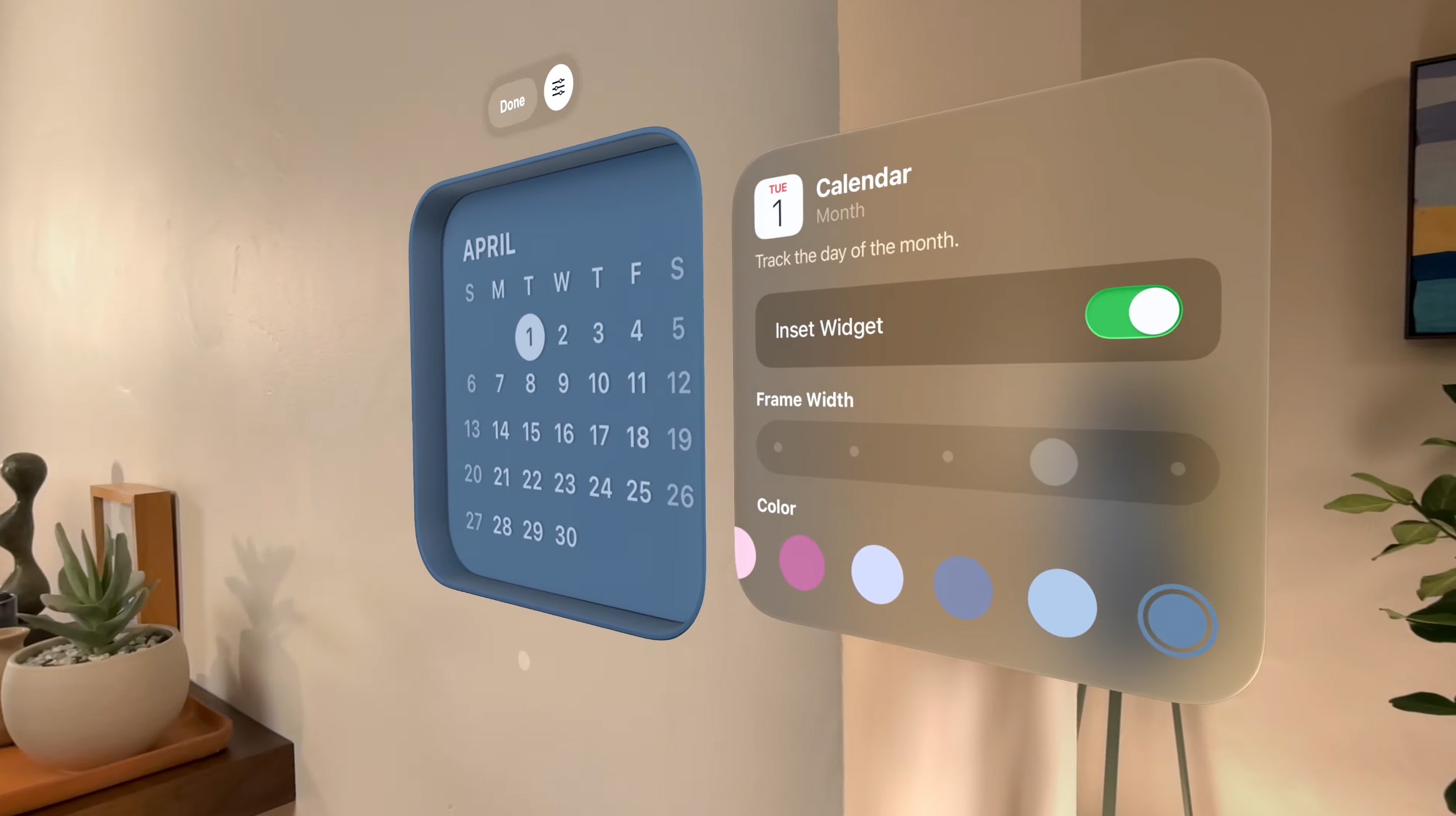
A key aspect of visionOS is the spatial interface. Menus and modals are no longer fixed in place, but rather they show up all around the users environment. 3D user interfaces are nothing new, but Apple's execution is the most polished.
Which brings us to, what I believe, to be Apple's vision (no pun intended) for the future of interfacing. We've seen countless years of innovation in traditional human to computer interaction recently with the introduction of massively adopted mixed reality headsets, and now with the popularity of natural language processing in AI software, we are seeing the traditional interfacing trends of computing slowly evolve.
I believe that iOS 26 is all about validating and supporting the content, while keeping the UI minimal. That's why the liquid glass blur effect is so prevalent in all the UI - It encourages the user to focus on the content first, while keeping the UI minimal and invisible. This doesn't mean that the UI is no longer important, but rather it signals a change in direction of how Apple expects the user to see the interface - invisible, but always at the hand of the user when needed.
Of course, no adoption is without criticism. I've seen people talk about the accessibility issues with the way the glass blur effect renders on screen, which makes reading text on certain backgrounds almost impossible. I'm sure that Apple will iterate and come up with the best version to help ease the transition. Many have also pointed out how Windows Aero is eerily similar to what Liquid Glass is trying to achieve, but I fail to see the difference – Glass blur effects have been around forever, but their adoption has never been this forward-thinking.
macOS Tahoe / Apple
In this new vision of UI, interfacing with software becomes personalized and the absolute fades into the environment. Getting used to this new way of interacting with our devices will take a long time, but ultimately it will provide a universal and ergonomic way for us to interface with our computers, which are far, far more powerful now than when keyboards, mice and other peripherals were invented.
It's an interesting time to be a designer right now. What you thought was absolute and the golden standard might be something completely different tomorrow. Taking risks, innovating and thinking of the best possible experience are critical. Disruptive changes only happen once a decade and it's exciting to be able to witness them.
Sources include Apple's WWDC25 keynote, images from Apple's press release.